A Rebrand Rooted in Purpose
Kelly Powell
on
July 15, 2025
At Cloud Control Media, we know that a brand is more than just a logo—it’s a reflection of who you are, what you believe, and how you show up for your clients. In this post, our Creative Director shares an inside look at the thoughtful process behind our recent rebrand.
Seeing the Need, Seizing the Moment
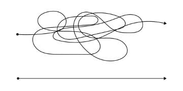
When I first joined Cloud Control Media, I didn’t think that our company’s visual identity fully captured who we are or what we stand for. The original logo had been in place before my time, and while it got the job done, it lacked strategic thought and intentionality—which defines so much of the work that we do.
Our brand deserved to reflect the depth, focus, and collaboration that sets our company apart. So, we set out to reimagine it.
Our recent brand refresh is so much more than just a new logo. It’s the result of thoughtful collaboration, a shared vision, and an overall desire to create something that truly represents our people, purpose, and path forward.
Why Now?
Branding isn’t simply about visuals; it’s about overall identity. I believe it should represent who you are, what you believe in, and why clients choose to work with you. For us, the previous branding lacked these critical connections and as we continued to grow, this disconnect became harder to ignore.
It was time for a change. Ultimately, we decided to first start with our logo—a foundational step in aligning our outward presence with our internal purpose. Our goal was simple: to create a brand identity that reflects the depth, precision, and perspective we bring into every client relationship.
A Small Mark with Big Meaning
Our new logo may look simple at first glance, but every element is packed with purpose. Each design choice is intentional and reflects who we are and how we work.
- The intertwined, angular Cs represent the seamless integration between our team and our clients. Collaboration is at the core of all that we do.
- The nested cubes formed by the angles in the Cs represent our commitment to digging more deeply, uncovering insights and making sense of complex data to drive smart outcomes.
- The chevron cap above the C represents an upward motion, signaling progress, growth, and a path forward for both our clients and company.
Interestingly enough, the final shape took on a subtle hexagon form, which was a happy coincidence we fully embraced. Hexagons are strong, structured, and efficient. They nest together like a honeycomb and symbolize teamwork, trust, and shared purpose that fuels our success.
What started as a logo redesign became a visual storytelling of how we think, work, and grow.
The Process
Our rebranding was a true team effort. Originally, the rebranding was intended to be done fully in-house, but we quickly realized the importance of having an outside perspective. Like many creative projects, we were too closely tied to it. We needed a fresh perspective to help bring our vision to life.
Working with a freelance designer, we worked together to develop a series of thoughtful concepts. After workshopping and refining through various versions, we narrowed it down to three top choices, which were then presented to the executive team. From there, we opened it up to a broader team for feedback and a final vote.
Ultimately, there were a lot of voices involved in the process, which made it both collaborative and challenging. But the team dialogue was worth it. Everyone wanted to feel seen and represented, and we settled on a direction that felt right for the whole team.
More Than a Logo
At Cloud Control Media, our brand has always been rooted in our people. That’s really where our company equity lives—not just in what we deliver, but in how we work together to deliver it. This rebranding wasn’t about reinventing who we are as much as it was aligning our visual identity with the strategic, forward-thinking culture that we’ve built.
One exercise that helped guide the process was exploring different brand archetypes. This gave us a shared language to define who we are and how we want to show up to the market. And for me personally, it was a lightbulb moment. The process helped me to see how we could bring more consistency, intention, and clarity to both our voice and our visuals; —it moved us from “what we look like” to “what we stand for.”
Looking Ahead
Like most creative endeavors, leading this rebranding was a learning process. From creative collaboration to rollout planning, to balancing inclusivity with decision-making, it was an effort of passion and purpose. I can confidently say that the new brand feels right and feels like us. It reflects our passion for data, our commitment to strategy, and the strong, people-first culture that drives us forward every day.
If I had to describe Cloud Control Media in only three words, they would be: Data-Driven. Dedicated. Strategic.
That’s who we are, and now it’s what our new branding represents. I look forward to seeing where it takes us next!
Kelly Powell brings over 20 years of award-winning design experience to her projects at Cloud Control Media. Her work at CCM focuses primarily on creating and optimizing landing pages and designing static and animated social media ads and email designs, but she has a wealth of experience that includes website design, branding, and print.
Linkedin