Ready, Set, CRO: How to Improve Website Conversion Rates

Today most marketers know it’s not enough to just drive traffic to your website. You also need visitors to convert—to do what you want them to do once on your website such as purchase a product or fill out a request for information form. When more visitors convert, you achieve a better conversion rate, and great website conversion rates are a smart marketer’s dream.

How to Achieve Great Conversion Rates on Your Website

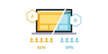
Marketers love to run A/B tests in pursuit of higher conversions. But how do you decide what to test and how do you achieve your conversion rate goals? The answer: Conversion Rate Optimization! (Or CRO for short.)

CRO is the methodological process of improving conversions—or any desired action—of visitors on your website. Running carefully planned A/B or multivariant tests is a large part of the process. However, it’s not the only responsibility of a CRO team.

A/B Test is a bit of a marketing buzz term. Most marketers know that testing is important, but the problem is, for some people, that’s the extent of their knowledge. They know it needs to be done, they have a hunch what might work better, so they order their web design team to run a test. But at the end, they don’t have any real answers or improvements to make because their process was not data based.

Get Started with CRO on Your Website

So, how do you do it correctly? You follow a process! And you don’t solely rely on hunches. Hunches can be a great kicking off point, especially if you’re a seasoned marketer with lots of institutional knowledge about what usually works best. However, it’s best to back that hunch up with data—data don’t have preconceived notions about what website visitors should do or what looks pretty. Data are fact-based and verifiable.

The first step to implement CRO is to make sure your analytics tools are all squared away. There are a lot of tools available to help improve your website and a great place to start is with Google. GA4 is free and powerful. You can follow your visitors throughout their website journey, see where they fall off or get distracted. You can get a deeper understanding by setting up custom events to track actions that are specific to your website and customer journey.

Next you might want to consider behavior tracking tools that can provide heat maps and session recordings. There are dozens upon dozens of these tools available with price points varying from free to thousands of dollars. Find one that fits your needs and you’ll be armed with even more data and visitor information to power your CRO strategy.

Once you have GA4 set up and any other behavior tracking tools, you’ll want to take a deep dive into your website. Explore the paths that visitors take through your site. Where do they start and where do they exit? Are they finding the information they need? How do they interact with your website? After you’ve answered some valuable questions, you’ll be able to pinpoint the places that need improvement—the places you can test.

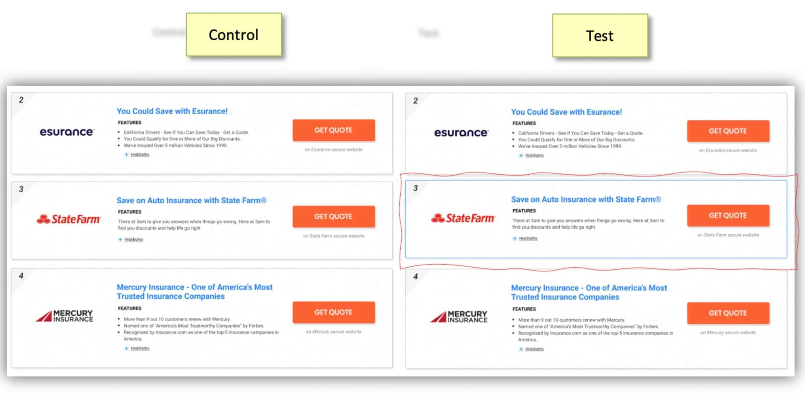
For example, analysis might show one page has a higher exit rate than average, so you take a look at the heatmap for the page and session recordings. These empirical data show that users are clicking on the title text to download your ebook but many are not scrolling down to the actual ebook download button. This suggests that visitors might find it frustrating that the title text doesn’t actually download the ebook and then they abandon the page. This is a test opportunity! Consider a test that would add an anchor link from the title text to the CTA button or move the button higher on the page.

Time to Test Your CRO Website Updates

The moment you’ve been waiting for, well, almost. Before flipping the switch on your test it’s important to have it properly outlined, starting with your overall hypothesis. Your hypothesis should clearly state what you expect to happen. For example, if we change the location of the download button, then we expect to see an increase in download conversions. In addition to a hypothesis be sure to determine your key performance indicators (KPIs) as well as your goals. For the test to truly be successful, you need to decide what it means to be a success.

Another important consideration for your test is the schedule. How long will you run it—a week, a month? How many visitors will need to visit your test to reach statistical significance?

Finally, it’s time to contact your design team and get that test running! (If your team doesn’t have a system in place to run a split test there are oodles of tools to help.)

Remember, once you’re done with the test and confirmed the accuracy of your hypothesis and set the winning design in place, you’re still not done. CRO is a continuous process. Take the results from your test, learn more from it, continue to analyze your website and find the next focus area—the next test to run.

Need help getting your CRO program off the ground? Contact the experts at CloudControlMedia.


Marcy Ansley is the Director of Email and Social Engagement at CloudControlMedia. She has more than a decade of experience working within marketing agencies where she has overseen email and social media strategies, and helped to improve website performance.

How to Improve User Experience for More Conversions

Reducing User Friction through UI/UX Improvement on Form Flows and Shopping Result

Optimization is a keyword very much used in the digital space. Everything is measurable on the internet, which facilitates the creation of enhancement processes to improve user experience, yield, revenue, margins, and quality. All these points will directly influence the business’s bottom line.

If you want to increase that bottom line, build an optimization pipeline, prioritize actions, and always strive to incrementally improve conversions and engagement.

How to Build a Pipeline of Optimizations

Identify Potential Issues

Before building your optimization strategy, you’ll need to follow three critical steps to identify the problems you are trying to solve. It seems an obvious statement, but it’s not a simple exercise. That’s why breaking down your issues into different boxes can help you build a systematic problem-solving approach in your organization.

  • Identify your business digital goals and barriers. Start by defining a significant goal, such as increase form completion rate and then dissect it by adding the obstacles, such as: (1) my form is too long with many steps (generates too much friction), (2) the engagement with my landing page varies in function of the traffic source, (3) the step-by-step drop-off rate is too high on pages/questions that request personal information (user trust issue). Once this is done, you’ll have sub-problems that are easier to address and tackle
  • Mine your data to help you detect issues that haven’t been recognized yet. An analytical approach can support your problem definition process by pointing quantitively where engagement is weak and where you are losing your users. The data will also help you prioritize issues that must be solved first given the high impact on your results.
  • Map all touchpoints that generate friction either caused by high time-consuming or user irritation to complete actions on your site; thus, you must use technology to help you find solutions that facilitate the user’s journey. Simple plug-ins for autofill or usage of Facebook/Google log in are good examples, as well as integrations with any 3rd party data. For instance, if you have a home improvement company and need details regarding a property to budget a project, you can get integrate your site to look up via home address all required information like square feet, the number of beds and bathrooms, and type of property. The same ideas can be applied for vehicle information lookup only by asking VIN to pull information and decrease user friction.

Define Your Roadmap

Your next step now is to prioritize the issues you’ll need to work on and build a roadmap taking into consideration the complexity of the project (creative, development and QA) and the potential impact of your incremental and strategic initiatives. Have a good balance between your initiatives and use agile methodology to manage your pipeline more efficiently and effectively.

Roadmap Execution

Finally, the fun part: idealization, and execution. Break this final step into six actions, and some of them can happen concomitantly:

  • Competitive analysis: check what your competitors are doing, see how they handle similar problems that you have identified on your digital product, and strive for an even better implementation. Build a table with all your top competitors and identify how they addressed solutions for common problems.
  • Consumer survey: surveying your audience will help calibrate and validate your hypothesis, and you’ll be able to collect people’s opinions and behaviors that can be used in decision-making. One piece of advice on how you’ll build it – if it’s not a focus group, avoid open questions that are hard to make a table out of it; make direct questions and offer options for users to select or rank.
  • Leverage your creative team: if you have an internal creative agency at your company, involve them in the ideation and solution of problems you have mapped before. Designers have a good understanding of usability and user experience and can strongly contribute.
  • Build hypothesis: this is the best way to make sure you know why you are testing, what’s being changed, and what you can expect as an outcome. The test will prove if your hypothesis was right or wrong and that’s why it must be a statement. Use three magical words to help you “by”, “I believe” and “because.” Here’s an example: By switching CTA copy from “Apply’ to “Continue,” I believe users will feel less intimidated to click because the word “Continue” brings a feeling of less commitment and may result in increasing click-through on the button.
  • KPI definition: the primary KPI should come from the hypothesis you’ve built. That’s what will guide the analysis and decision-making. It must be quantifiable over a particular time for a specific objective. You’ll probably need to consider some secondary KPIs that will change in function of your primary one and will help you determine which variable was most affected. For example, with the CTA test (Appy vs. Continue), if your users still need to complete another action on the step ahead, you’ll need to measure if the test does not negatively impact it, affecting the end-to-end journey.
  • Documentation: not the most fun part, but essential so you can keep track of how the tests performed and what hypotheses were tested to make your roadmap very efficient.

Ideas to Test

Now that you know how to build a more effective pipeline, let’s dive into some ideas and options for testing. We’ve been running multiple tests on our form flows and result pages (listings) in the past years. Here are eight of them for you to check:

1. Form Flow: Progress Tracker

Test Hypothesis: by changing our progress tracker to a wheel format, we believe users will have a more tangible notion of how close they are to reaching the final goal because it’s a numerical approach, leading to higher form completion.

Test Results: increase of 6% on Desktop and 4% on Mobile form completion

Landing Page: Featuring Call Outs

Test Hypothesis: by featuring different sub-products on the landing page, we believe users will better understand we can fulfill their specific needs because they are clearly outlined, leading to a lower bounce rate and thus a higher form completionprogress tracker

Test Results: decreased bounce rate by 6% on Desktop and 2% on Mobile

  • Landing Page: Featuring Call Outs

Test Hypothesis: by featuring different sub-products on the landing page, we believe users will better understand we can fulfill their specific needs because they are clearly outlined, leading to a lower bounce rate and thus a higher form completion

Test results: decreased bounce rate by 6% on Desktop and 2% on Mobile

2. Landing Page: Featuring Call Outs

Test Hypothesis: by featuring different sub-products on the landing page, we believe users will better understand we can fulfill their specific needs because they are clearly outlined, leading to a lower bounce rate and thus a higher form completion

landing page example with call outs

Test results: decreased bounce rate by 6% on Desktop and 2% on Mobile

3. Listings Results: Hover-Over Animation

Test Hypothesis: by enticing users with a lively user interface, we believe it will better grab their attention, increasing engagement and leading to a higher click-through rate

hover over animation

Test results: increased click-through rate by 3%

4. Landing Page: Sticky Banner

Test Hypothesis: by sticking “an actionable banner” when the user scrolls past the main CTA button, we believe users will be encouraged to freely scroll through the page and browse, having an easy way to start the shopping process, leading to a lower bounce rate.Sticky banner

Test Results: decreased bounce rate by 5%

5. Listings Results: Featuring Position on the Results Page

Test Hypothesis: by featuring the 1st listings at the bottom of the page, we believe we’ll increase attention and click concentration to the top position because we are evidencing the recommended advertiser leading to a higher yield.

 position search results page

Test Results: increased number of clicks on top position by 4%.

6. Listings Results: Ribbons

Test Hypothesis: by adding a call out in a shape of a ribbon on the listings results, we believe users will better engage with the offer because a new visual element adds value, leading to a higher click-through rate.

Ribbons

Test Results: increased CTR by 5%-8%

7. Form Flow: Adding Tips to Guide Users Throughout the Questionnaire

Test Hypothesis: by adding a virtual advisor in each flow question, we believe users will better engage because it will be easier to understand how to answer more complex questions and their purpose, leading to a lower step drop-off rate.

Questionary

Test Results: drop-off rate reduction varied depending on step/question, ranging from 0.3%-1.2%

8. Form Flow: Combining Binary Questions

Test Hypothesis: by combining binary questions in one step, we believe usability will improve because users can repeat the same action (choose and click one out of 2 options) in sequence, leading to a lower step drop-off rate.

Binary Questions

Test Results: combined drop-off for grouped questions decreased by 50% leading to a 2.2% higher form completion

Conclusion

Building an optimization process is essential for any business with a digital presence. Some key steps must be followed to guarantee efficiency and efficacy, such as (1) identifying problems to be solved by setting your digital business goals, (2) using data and analytics to support, and (3) mapping touchpoints of friction with your audience. Once the key steps are completed, you should define your roadmap considering execution time and complexity, resourcing, and impact; these are all fundamental points to ensure the prioritization was done correctly. When it comes to execution, remember to do a thorough competitive analysis, bring your creative team in the idealization process, survey your consumers, build your hypotheses, define KPIs in function of the hypotheses, and document everything. Get inspiration from some of the tests mentioned in this article and get you’re a/b testing process in place.

Are you ready to get better results from all your digital marketing? Let the experts at CloudControlMedia help. Learn more today.

Guilherme Montanini, Director of Product Management, Monetization at QuinStreet

How to Optimize Your Landing Page

A landing page is a standalone web page that visitors “land” on after clicking a paid google search result, social media or banner display ad. Sometimes called “prison pages” these pages focus on a single call to action (CTA) and don’t have traditional page navigation or outgoing links. A well-designed landing page is a powerful digital marketing tool, but to maximize your conversion rates there are some important points to keep in mind.

user landing page

Think of the User When Building a Landing Page

When designing a landing page you always want to start by putting yourself in the shoes of your user.

Who are they? Even the most beautifully designed page won’t convert if you don’t talk to the right audience. Take the steps to identify 2-3 “typical” members of your target audience and use those personas to guide your decisions for page content.

What are their pain points? Identify what problems you can solve for your audience and focus on how your product or service can solve them.

Where are they in their journey? Tailor your content to where your user might be in their buying journey. Someone starting to research their options will be looking for different information than someone ready to make a purchase.

How can you help them? Ultimately, customers want to know how you can help them. Don’t overload them with information about how great you are, but instead let them know how you can make their life better. Use “you” more than “we”.

reviews landing page

Foster Trust on Your Landing Pages

First and foremost, users need to know that they can trust you and your page.

Make sure your message matches the ad. To minimize bounce rates, and increase quality scores, make sure that your landing page pays off on the offer/promise/claim made in whatever ad brought them to it. If you use more than one offer, have multiple pages to match. Upon clicking an ad, your user should immediately feel confirmed that they are in the right place and will find the answers they were promised.

You’re the expert. Once your user is confident they are in the right place, you’ll need to prove your expertise. In addition to writing meaningful copy, showcase accreditations, certifications, and/or media endorsements. Provide social proof by including useful reviews and testimonials (ideally with a profile photo) from your customers.

Consistency is key. Lastly, make sure your page design is not only consistent with the content and look of the source ad, but also with your main site and other marketing materials. Consistency encourages brand recognition, adds a level of professionalism, and builds trust with your audience.

simple lines

Keep Your Landing Page Simple

A landing page is not a mini website—it’s a targeted message to a targeted group. It needs to capture your audience’s attention and entice them to learn more, without overwhelming them with every detail. Every choice for your landing page content should be intentional and add value—this isn’t the time to add extra fluff.

Have a Singular CTA. Eliminate all navigation and external links. Your page has a singular purpose. Whether that purpose is to get your user to “Learn More”, “Buy Now”, or “Download”, every bit of content should speak to that purpose. Don’t exhaust users with too many options. Instead, lead them where you want them to go and use your page elements to reinforce that singular goal.

Compelling Imagery: Utilize high quality, professional imagery that relates to your audience. Stock images are fine as long as they are carefully chosen to align with your user personas and have a consistent style. Avoid sliders and distracting video backgrounds. Careful use of animation can help grab attention but use sparingly so as not to distract from the primary goal of the page. Product videos or video testimonials can be powerful but keep them short.

Concise Copy: Copy should be tailored to your audience, clear, and scannable. Use short, digestible chunks of copy, punctuated by clear subheads that make it easy for the user to scan for the information that matters most to them.

Anticipate questions. Again (always!) think of your user and what kinds of barriers they may have prior to converting. Answer those objections in your page copy.

landing page design

Include Components of Smart Landing Page Design

Have a hierarchy of elements. Use size, typeface selections, grouping and white space to guide your user through the most important elements of the page.

White space is important! Having space around an element helps to call attention to it. White space also gives the viewer a place to visually rest and helps keep the overall page from feeling cluttered and overwhelming.

Keep forms as short as possible. Don’t ask for more information than what is essential to achieve your goal. Keep your user in mind—people will be less likely to fill out more fields the earlier they are in their decision-making process. If a longer form is necessary, consider breaking it into 2-3 shorter steps, but be sure to indicate that to the user by including “step 1 of 2” or some other progress indicator.

Contrasting color for CTA button. Be sure to use brand colors on your page but select a contrasting color for your CTA and use sparingly for information you want to call particular attention to.

Use icons to break up text. Icons help to visually communicate a concept, which can help to reinforce ideas outlined in your copy and also serve as a way to break up sections of longer text, helping to make the page feel more inviting and (when paired with white space) less cluttered.

Optimize for mobile. It depends on your audience, but often mobile is the primary experience for b2c interactions. Make sure your pages are optimized for easy viewing on a mobile device. Clarity, simplicity, and ample space between elements is even more important on mobile. Keep image file sizes small and be sure to include useful alt tags for accessibility.

Have CTA above the fold. It can be tricky to manage the small amount of real estate above the fold, but testing shows that conversion rates are better when your form is higher on the page. Keeping the form above the fold also ensures that the majority of visitors will see your call to action.

a/b test

Test, test, test.

These design tips can help to improve conversions, but the only way to be sure you’re getting the best conversion rates possible is to run AB tests. Common tests can include hero image options, headlines, button color, form length, and page length. If a page is performing poorly, it’s best to do a multivariate test—meaning test multiple changes at once for a greater chance at seeing a positive impact. If your page is already doing well, it’s best to make small changes, one at a time, so that you can get a better idea of which changes most affect performance for your particular audience.

Summary:

There is no one-size-fits-all in landing page design, but there are certain key considerations that are common among successful pages.

  • Know your user and keep them in mind throughout the process
  • Foster trust
  • Keep a simple, singular focus
  • Include components of smart design
  • Test, test, and test some more

CRO: How Heatmaps Will Improve Enrollments

Conversion Rate Optimization (CRO) is all about inducing potential students to act once they land on your ads, website, and collateral pages. It may feel great to get visitors and clicks, but without conversions, those actions are just vanity metrics. If you want actual enrollments, integrate data from heatmaps into your CRO strategy. It will help improve conversions that matter, whether the action you hope users to take is a request for more information, a campus visit, an application start, or an enrollment.

CRO and The Enrollment Funnel

Students don’t land on your website with only your institution in mind. Whether they’re looking for a four-year home, a short-term career-training program, a certificate or an advanced degree, they’re on a search. Your job is to show them how what you do aligns with what they need. How can your website and pages grab their attention and urge them to take the action you want?

CRO Basics for Education

You’ve probably heard that search engine optimization can help you build site structure and content to ensure that you show up on search engines. CRO takes SEO a step further. Because you don’t just want to show up in a search. You want likely students to convert; to take a specific action. Small changes in the way you present content, whether that’s an ad, a landing page, your homepage, or even a blog post, can make a big difference in the results you see.

A desired action might be to have potential students fill out a form to request more information. So how can CRO help that occur? By testing various form lengths. Or choosing different colors and styles and placements of that form. Or simply changing out the call-to-action button. Those seemingly tiny tweaks can lead to higher conversions.

Heatmaps for CRO

CRO depends on data to see what works. What will work depends on how you use that data. Success generally comes when you take past experiences, recent data and good instincts and test a new approach to make educated hypotheses about how people will act. But what if you could see how they acted? Not just where they clicked, but also where they scrolled and stopped—and where they dropped off the page entirely.

That’s how heatmaps work.

The most common heatmap is solely about clicks. It tracks where and when users click, which helps tell you what they’re interested in. Let’s say they come to your blog from a promoted post on social media. Maybe they read the post to its end. Or do they click a link within? Or did your content in that post prompt them to click on a program page? Click heatmaps can help you see what works by seeing where your users click. Scroll heatmaps consider how users scroll. Do they make it to the end of the page? Do they even know that they can scroll?

But what if you could see what your users see? Where they look as they look at your pages? Eye-tracking heatmaps don’t actually follow users’ eyes, but they do follow the path of their cursors. Now you really know what they care about—and that’s CRO gold! If their attention is attracted to an image at the expense of your form, tone it down. If they interact with something at the bottom of the page, move it to the top. And if they ignore your form, fix it!


If you want users to convert and not bounce, CRO is vital. Find out how to add heatmapping to CRO to improve even great results. Contact the CRO experts at CloudControlMedia today.


~Linda Emma

Our Services

We are Experts at Understanding Every Stage of Your Customer Life Cycle

Paid Advertising

Search Engine Marketing
Social Media Advertising
Programmatic Advertising

Conversion & Engagement

Conversion Rate Optimization
Email Marketing

Organic Marketing

Search Engine Optimization
Content Marketing
Social media Management

Other

Analytics & Reporting
Creative